2010年5月8日星期六


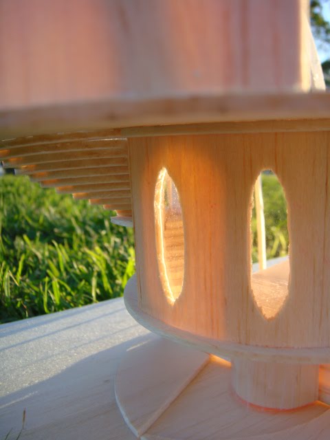


Final submission-Drawings

Initial sketch

Parti

Axonometric 1:100

Plan 1:100

Section1 1:100

Section2 1:100
Negative Fee back from my tutor-CARDBOARD HOUSE
Architectonic skill is not presented well in my presetation. For example the thinckness of walls are not realistic. However in my final drawings, I drew the wall is 20cm(2mm in 1:100) thick, based on the fact.
2010年4月21日星期三
ARCH1201-Pro 2
Gabriel Metsu (January 1629- October 24, 1667) was a Dutch painter of history paintings, genre works and portraits.

Man Writing a Letter 1662-65 (selected)


Man Writing a Letter 1662-65 (selected)

Woman Reading a Letter 1662-65
"...it is only outside the Beit Woman Reading a Letter, in its pendant depicting a man writing a letter to the woman, that Metsu admits to the problem what is absent. This invention of the pendant is his. No other painter does it at the time. In his common-sense way, Metsu reminds us of the social circumstances, the parted correspondents, upon which the letter representation depends. Separated by their frames, in their separate rooms, these lovers can forever attend to the represetation of love rather than engage in love itself."
- Svetlana Alpers, ' The Art of Describing'
Self Exploration on the painting:
According from the previous description by Svetlana Alpers, the painting is impressed on me favourably. Back in that time, these two independent paintings were actually designed to relate on each other in a sequence. The letter is written by the man is dramatically the one holding on the woman’s hand. They make more sense like drama show on television in these days. Together they tell a love story. The selected painting seems to depict a noble man who backs in a hurry, sitting in a front of a table near an open window and rapidly writes a letter to his lover may about what his thought or what he has been through in the middle of his trip at this moment. He is fully concentrated on his letter even in an uncomfortable pose. Now he looks calm and a smile of pleasure passes across his face. The room he is in is paved with black-white tiles; while the table is pushed into a corner covers with a huge red tablecloth. There are also several unidentified equipments such as some kind of silver containers as well as a wooden one falling on that table. The window in this painting swing inward which isolates the globe at the back. There is also a painting with a rich frame hang on the other side of the room. It is hard to describe what actually it is. However there are several camels resting inside the painting seems in a particular travel circumstance.
Light: natural sun light, warm, golden, illuminate the majority of the room
My narrative: A place for a man can forever attend to the representation of love.
My site: E Ji Na, Inner Mongolia, China, Autumn


There are 2 reasons for choosing this site:
1. In this particular time, the site's color matches with my painting. I want to maintian the color tone in my design.
The majority of the room in the painting is exposed under the sun. Unconsciously it is telling us that the relationship between the room and the external space are very close. The room is quite open, can be influenced directly from the outside.
2. Through self exploration on the painting, I imagine the man is in his travelling trip and away from his lover. So I decide to select a place which is isolated from crowed cities, then he can freely enjoy on representation love to his lover.
Concept:
There are numinous ways to represent a love especially in these days. You can directly though conversation, write a letter same as the man does in the painting, or you can take an action.
So my idea is create a meeting place for couples to get together. Since they are getting together, they are actually taking the option on action to represent their love.
There are numinous ways to represent a love especially in these days. You can directly though conversation, write a letter same as the man does in the painting, or you can take an action.
So my idea is create a meeting place for couples to get together. Since they are getting together, they are actually taking the option on action to represent their love.
Analyzing a clean understanding of different types of internal spaces (From my tutor)

Living room

Bathroom
These two different rooms are all under the internal space category. However each of them is provide completely different relationship with external condition. Living room is open and created forward to outside while the bathroom is tried to be more isolated to the outside.
Meeting place-My idea draws from my previous assignment


This is a meeting place for two famous people to get together. It provides in a more private space. I also want to create a private meeting place for couples, but it has to be more open to the external.
Final design components:
1. Two intersectant staircases: I decide to use the two staircases which toward different directions, bring couple get together and isolate from others in a higher-level, private space.
2. Curved wall & high ceiling: I use the curved wall in the internal space. Because it expands the room in a circular shape and feels more invited to outside. High ceiling makes the room space much bigger and provides completely different style of private space.
3. Elliptic windows: romantic figure, more welcoming
4. Balcony: It is a external place for couple to get up level and view its surroundings.
5. Curved column: It is used for block the internal view and balance the whole structure of this building.
1. Two intersectant staircases: I decide to use the two staircases which toward different directions, bring couple get together and isolate from others in a higher-level, private space.
2. Curved wall & high ceiling: I use the curved wall in the internal space. Because it expands the room in a circular shape and feels more invited to outside. High ceiling makes the room space much bigger and provides completely different style of private space.
3. Elliptic windows: romantic figure, more welcoming
4. Balcony: It is a external place for couple to get up level and view its surroundings.
5. Curved column: It is used for block the internal view and balance the whole structure of this building.
6. Matrial: brick veneer construction
2010年4月5日星期一


2010年4月4日星期日


ARCH1201-2010( Pro1 Exercise week1-3)
ARTIFICE - House for Dr Bartholomeusz 1961-63 - Geoffrey Bawa
GEOFFREY BAWA:
"One of the supreme example of an architect: fully conversant with contemporary technology and international developments, but with a deep understanding and feeling for -vernacular."
THE ARCHITECT'S OFFICE, COLOMBA SRI LANKA

GEOFFREY BAWA:
"One of the supreme example of an architect: fully conversant with contemporary technology and international developments, but with a deep understanding and feeling for -vernacular."
THE ARCHITECT'S OFFICE, COLOMBA SRI LANKA
The office had originally been planned as a doctor’s house, but by the time the foundations had grown to ground level he had decided to stay where he was and Bawa as able to buy the property and to convert it into an office. Thus, the original spaces were transformed to suit the architect’s convenience: kitchen into accounts office, quantity surveying in the pantry, the three upstairs bedrooms into one main drawing room-lying between the two courtyards-into the main meeting room and Bawa’s office.
Original Design
A two-story entrance archway
l . Separated from the street
2. Containing garages, servants’ accommodation
.
courtyard
.
A single –story pavilion contains a dining room and kitchens
.
.courtyard
.
Main pavilion is a principal living room with bedrooms on an up floor
.
courtyard
.
l . Separated from the street
2. Containing garages, servants’ accommodation
.
courtyard
.
A single –story pavilion contains a dining room and kitchens
.
.courtyard
.
Main pavilion is a principal living room with bedrooms on an up floor
.
courtyard
.


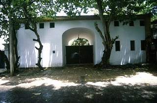


The middle courtyard with a pool
Architect's office and conference area in the 1st level of the main pavilion
Architect's office, verandah and courtyard also in the 1st level of main pavilion
The view on 2nd floor of the main pavilion
Two innovations:- Polished coconut trunks were used in conjuction with granite bases and capitals to protect them from termite attack.
- The ' tile-on-cement' roof made its first appearance.The roof was the critical element in tropical architectureand experimented with a number of alternative materials and methods of construction:flat roofs were difficult to seal and tended to get hot, though earth-covered slabs had yields interesting results; interlocking 'Calicut' or 'Mangalore' tiles were lightweight and requried relatively minimal timber support but offere little insulation ; traditional flat Kandyan tiles needed high maintenance and had to be laid to steep pitches; corrugated cement sheeting was light, easy to support and highly waterproof but unbearably hot and totally unattractive; the half-round 'Portuguese' tile produced a pleasing texture and goog thermal mass, but its double layering required a complex and costly timber structure of battens, close-spaced rafters, purlins and trusses.The final solution for the roof is the idea of laying Portuguese tiles in and over the corrugations of cement sheeting. The advantages of combine the two materials togther are achieved in excellent waterproof qualities, good insulation and attractive appearance and minimized their disadvantages.


Source:Robson, David. 2002. Geoffrey Bawa: The Complete Works. London: Thames and Hudson
'GEOFFREY BAWA '(Revised edition) By Brian Brace Taylor
These are the only information I have found for House for Dr Bartholomeusz 1961-63. However through these limited information, we can still get quite clear on how the real house looks like. It is a typical house which belongs more to the traditional house around East Asian since it covers with lambdoid tile roofs. The house is closed by boundary away from a street, assembled with 3 pavilions and embedded 3 courtyards as well inside the site. So the entire building is isolated itself from the outside world.
Parti Exercise
Hierarchy
Movement & Intermedia 
Geomatry & Symmetry
In my Parti drawings, I want to represent 3 major characters which applied as part of this architectural design. They also make the house more unique as oppose to the other villas in this project.
Hierarchy: First of all, I think hierarchy plays an interesting role in this longitudinal site. As we see, the house is carefully designed in a progression which uncertainly forces you to walk inside and end up as the main pavilion. It suddenly remains me ancient Chinese house. They have a similarity which the separated pavilions as well as the courtyard are related to each other very closely. In fact, they are fundamental elements in this kind of house, even they looks isolate from others
Movement: Secondly I realize the architect had designed two completely different adventures in this house. You may choose to walk in a complex way which leads you to walk through all pavilions and cross the courtyards as well, or you may walk in a straight line near the right hand side boundary. Either of these will take you to the main pavilion.
Symmetry: See through the planning drawing, the last character I have found is the house is also expanded in symmetry based on the middle pool. As I understand, symmetry ties the design concept in a particular sequence and also simplifies the structure as influenced by the new trend in the modern architecture.
Geometry: I have also drawn some Parti diagrams based on geometry. They are represented in simple lines and boxes, mainly show the relationship between the pavilions and courtyards.
Poche diagram
I impressed from the amazing Poche drawing.


I quite enjoyed when I was doing Poche drawings.
2009年10月22日星期四
Workshop 3 Architecture in motion
Concept:
The dramatis persona of this story is a new architecture student of UNSW, standing in the front of the faculty, Red Center. She looks around, feels very excited. Ruler, scissors are symbols of pressure, suddenly dropping from the sky. While at this time, the protagonist understands the hardship of studying architecture. Then she carries all of this heavy equipment into the building, waits for an elevator with a group of people. After a long time, the elevator still does not come. Fortunately, fewer and fewer people are waiting for the elevator; finally, these are only 3 people, she and other 2. After another while, the elevator arrives. But it is full of people. Crowd pushes her far away from the elevator. When she realizes, the other group of people come. Suddenly the elevator is full of people again. In the front of her, the door closes. Luckily, the dramatis persona finds there is a hallway next to the elevator, slants toward the other side of this building. Then the dramatis persona goes along this aisle up to Level M.” How an open, quite place it is! I can do my model here.” The dramatis persona feel helpless while there is at least a hint of surprise at end.
Self reflection:
This workshop involves a time-based method of manual architectural representation by creating a 20 seconds imaginative spatial movie occurring in our Red Center. I was fully convinced there is no short way for any study. I spend a whole weekend drawing my movie background. There are a hundred and ten A4 pictures I have done at that stage. At the end I really could not persist in the drawings any more. Then I bought a wooden man from a design shop and took photos of the movement of the wooden man. Finally my 20 seconds movie completed. However my teacher was very angry. It was not satisfied in this workshop as it also contents drawing skill. My heart broke. I was mainly concentrate on the movie and had not touched any other homework at this stage. What an awful experience I have been through. This awful experience tells me if you take short cuts, you will end up with perdition.
订阅:
博文 (Atom)