Concept: A resting room for this crowded King st.
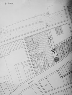
Site one: The reason I choose Site 1 is because it connects to a park at the back. I was trying to extend the park area to the front. On the other hand, there are limited parking services on the King st. So a car park sits at the back is convenient and vital for this gallery.
Light:
Site one: The reason I choose Site 1 is because it connects to a park at the back. I was trying to extend the park area to the front. On the other hand, there are limited parking services on the King st. So a car park sits at the back is convenient and vital for this gallery.
Light:
- I insert a 4 square meter courtyard inside the gallery which is primarily used for lighting interior space. Therefore it is a highlight to attract people on the street.
- An artistic ramp is carefully designed in a way to get more nature light from the open space above.
- There is a skylight in the middle of the triangle gap at the back side of the building. It is used only for the ground level.
Facility
Ground level:
It has a small gallery space combined with a sculpture garden towards the park at the end. A working room and a stockroom is also located on this level behind the small interior courtyard. It also provides a WC for public.
First level:
The entire space on the first level is used for the gallery as well. It is entered from an artistic ramp which nature light can shine into the level below. There is an office space pops out, faces the street. It is connected with adjacent buildings in a similar height and real decoration. On the real site, the second floors of adjacent buildings have just a wall without any opens. It seems to isolate away from the street. So I try to maintain this quality, have a wall with a longitudinal windows at the bottom. I have also define various of different spaces in different height which make people unconsciously move in a interesting way through that big space.
There is a balcony for people to go out at the back and overlook the sculpture garden. However it is not allowed for people to step on the skylight.
Second level:
A stair around the interior courtyard leads staff to go up into the second level. There is a kitchen and an apartment. They are only occupied half of the level and the other half is left to the main gallery space.
Material: The main material for this building is concrete.
Art work: The art work I will have later in my gallery is more about present oil paining which have focused more on the beauty of life as well as various size of sculpture concerned on same concept.
Leonid Afremov

Large size 40"x20"
Medium side 24"x 32"
small size 12"x 14"
Section Model


An artistic ramp


Drawings


